Page Builder > Theming
Layouts
How are theme layouts defined, and what do they do.
- what is a layout
- what are the internals of a layout
- how to create your custom layout and use it on a page
Overview
A layout defines the content hierarchy. It is a pattern that defines a website’s structure. It provides clear paths for navigation within webpages and puts the most important elements of a website front and center.
The most used layouts consist of three parts:
- header at the top containing links that help users to navigate around the website
- page content in the center
- footer at the very bottom containing various information about the website
Using Layout in Page Builder
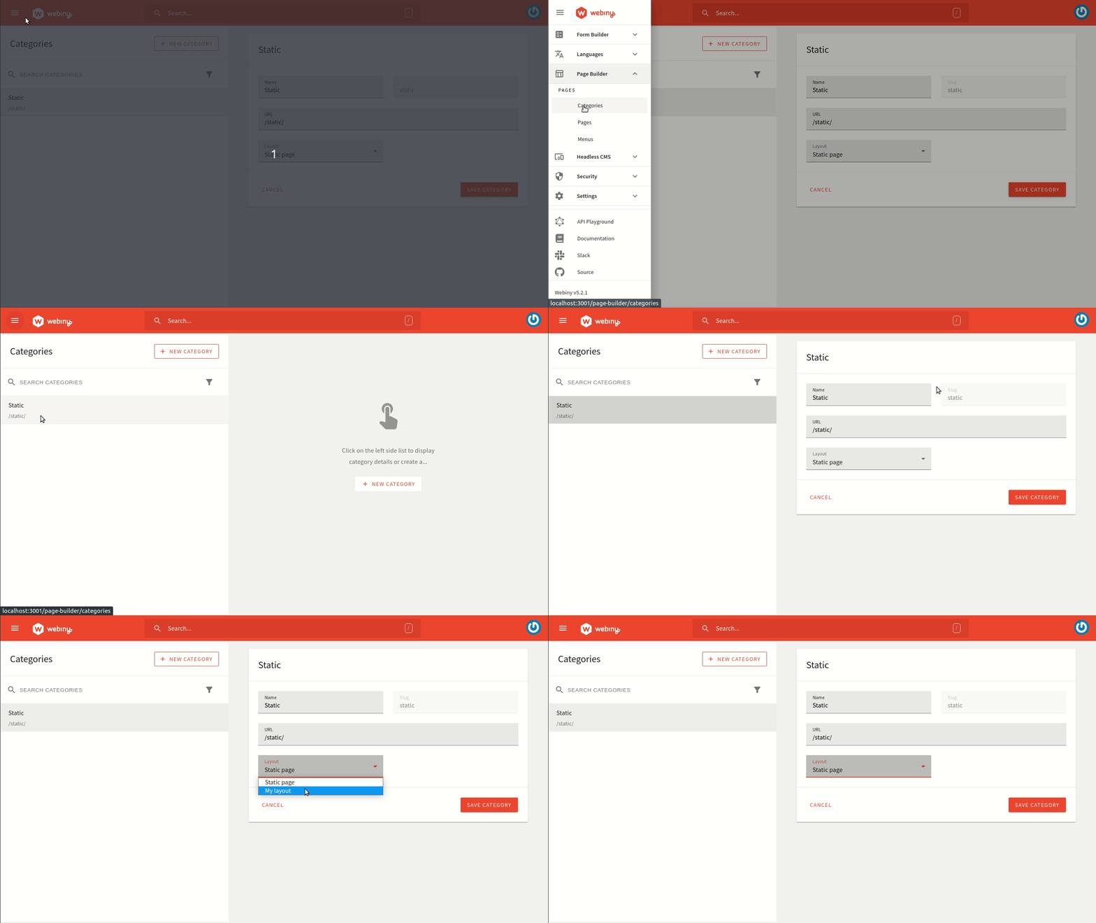
Layouts are linked to page categories. When you create a page category, say “Blog”, you need to select a layout inside which that content will be displayed.
The options available inside the layout dropdown are registered by the pb-page-layout plugin.
Each page created inside the “Blog” category, by default, use that layout. However, inside the page settings, you can overwrite that on a per-page basis if you need to.
 Webiny page categories
Layout Internals
A layout is a simple React component that receives several props. Here is an example of the static layout which comes with the default theme:
As you can see from the example above, we simply render a Header, Footer, and page content in between.
If you are creating your own layout, the structure is all up to you.
You can insert any DOM structure with any custom CSS classes you require. You can also import and use pretty much any 3rd party NPM library here.
Create Custom Layout
Now that we know what is a layout and what are its internals. Let’s create a custom layout of our own.
Create a new file named SimpleLayout.tsx inside apps/theme/pageBuilder/layouts and add the following content in it:
Now we register this layout as the pb-page-layout plugin.
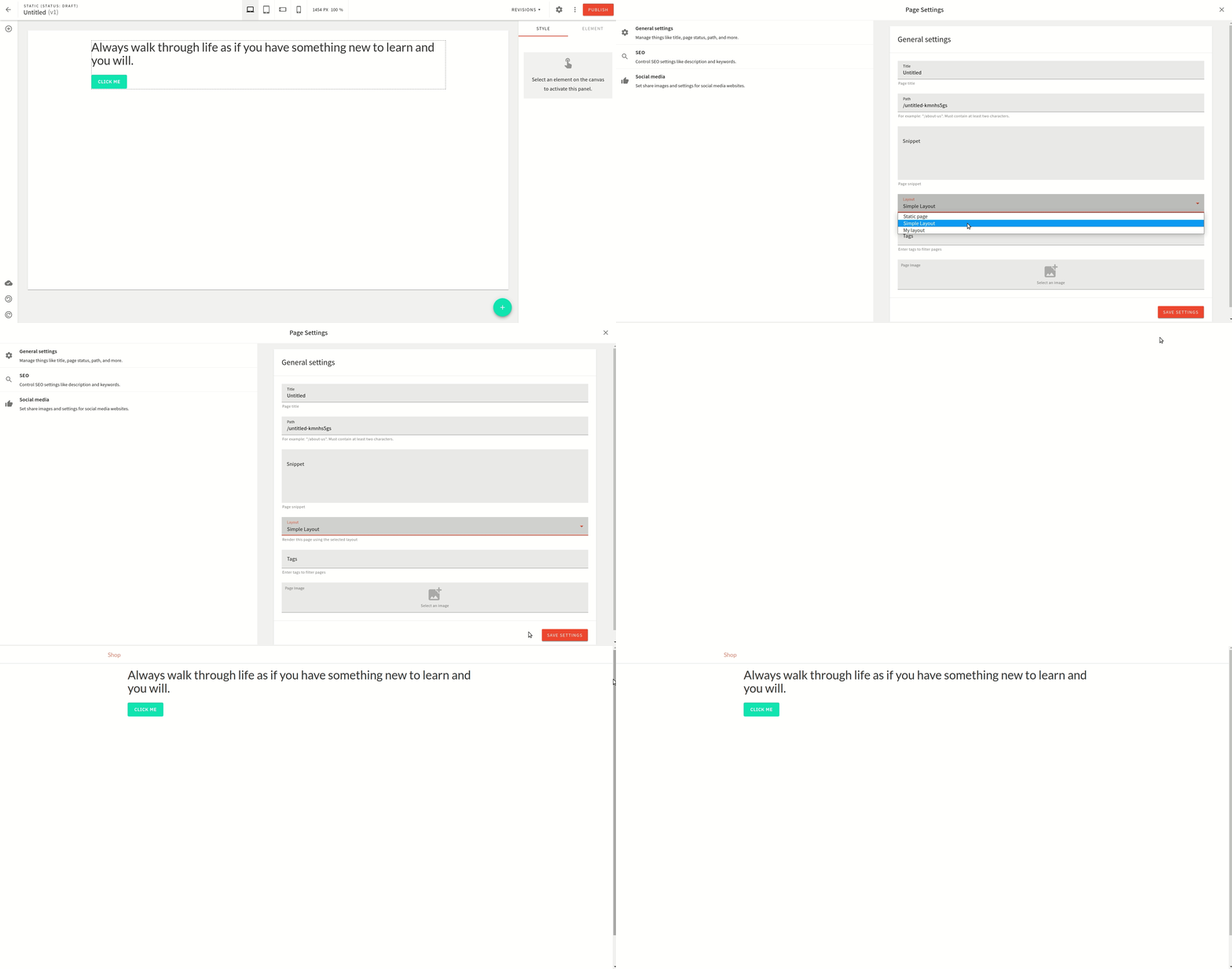
Let’s add the newly created layout to our page in the editor. It looks as shown below:
 Webiny page builder custom layout