Page Builder > Theming
Elements
What are elements, and how do they fit inside a Page Builder theme.
- how elements are used in Page Builder theme
- how to update elements in Page Builder theme
Overview
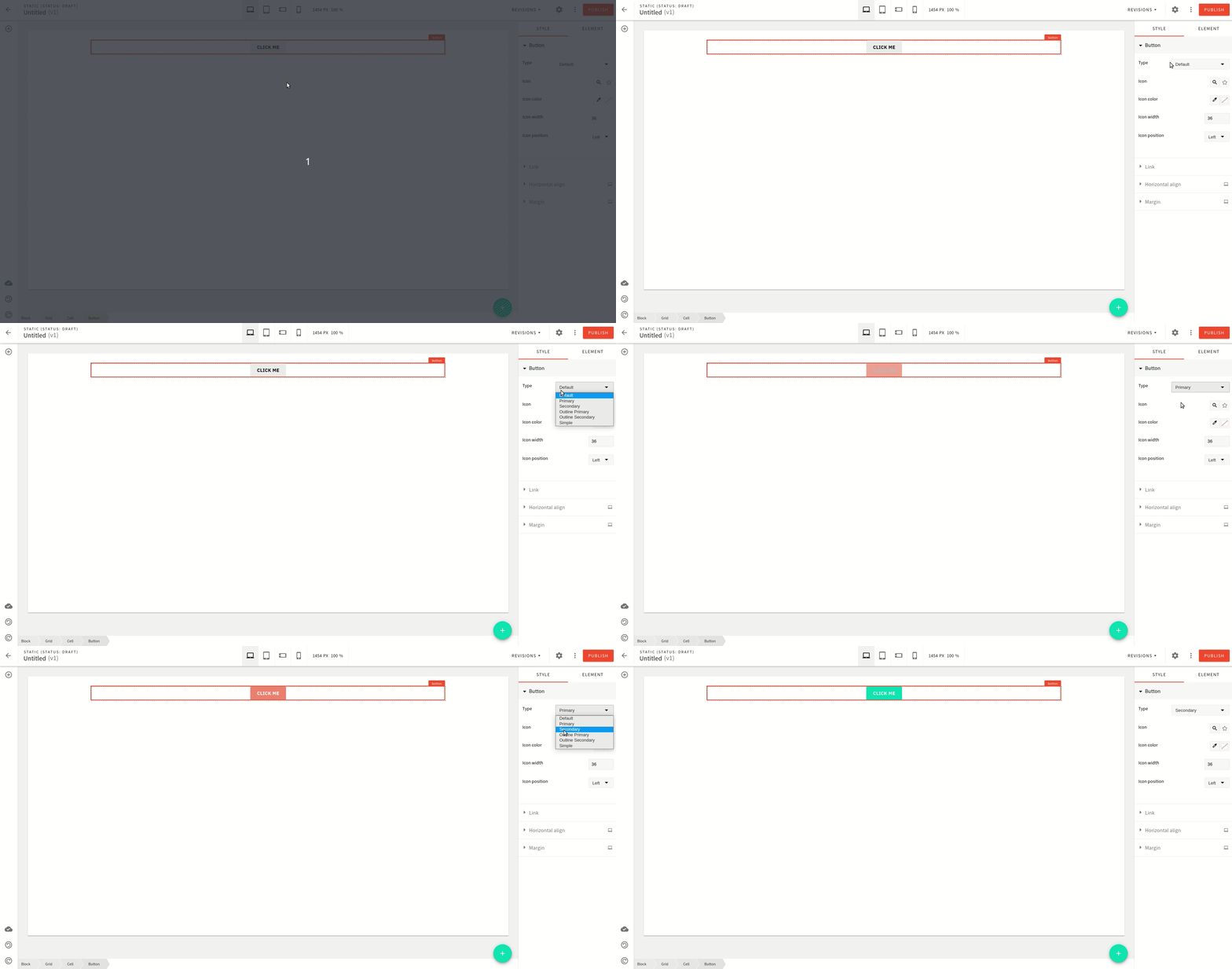
Another way Webiny Page Builder ensures that visual styles follow your design system is by having certain style presets for some of the elements like the Button element as shown below:
 Webiny theme elements
Elements Definition
Elements are defined in the elements section of the pb-theme plugin.
It defines certain attributes for Page Builder elements that you can insert into your page content.
For example:
Currently, only the following elements support this, for example:
buttonheadingparagraphlistquote
But the point is that if you create a custom component for Page Builder, you can reference the same mechanism and add this functionality to your custom elements.
The definition takes two keys:
className: Name of the CSS class that gets appended to that element.label: This is what’s shown in the dropdown when a user is selecting a style.
 Webiny theme elements
Button Element
In the case of the button element, the types attribute contains available button types.
Each type references a specific class name that gets added to the button component when that type is selected.
By default, Webiny uses BEM naming
webiny-pb-element-button, so when the user selects the primary button type,
it adds a modifier of primary to the base class, meaning the resulting class name becomes webiny-pb-element-button--primary.
Extend Button Element Types
We achieve this in two steps:
- Add a new item in button types
- Add styles corresponding to that type
Add New Item in Button Types
Make the following change in apps/theme/pageBuilder/index.ts
Add Styles
Make the following changes in apps/theme/pageBuilder/styles/elements/button.scss
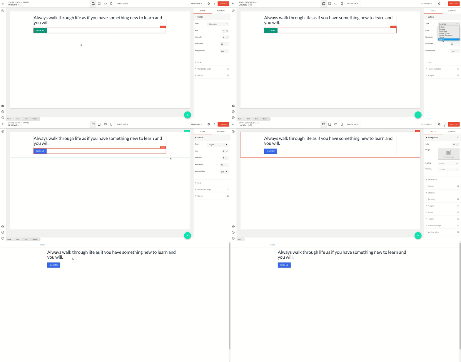
With these changes in place, the button element gets a new type available to use in the Page Builder editor as shown below:
 Webiny theme new button element type